by Next Wave Team | Aug 23, 2011
The Challenge
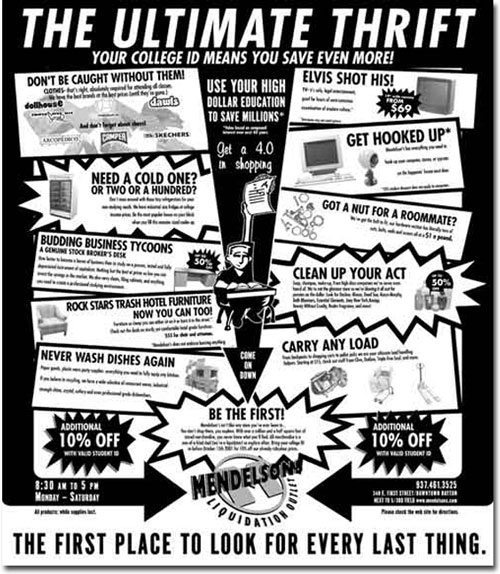
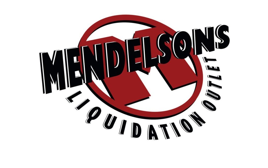
Retail brand marks need to be easily identifiable. Whether in a magazine, billboard or the web, the mark needs to instantly conjure up the identity of the client.
The Solution
For Mendelson’s we juxtaposed a retro design 3D type effect with the bold red M. It is a mix of old and new, much like the items the client sells. It gives this discount liquidator the strong image they needed for quick identification.
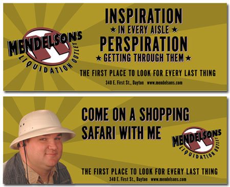
Expedition — This is the TV spot that started it all. The introduction of the “explorer” character who embarked on “one of life’s great adventures” roaming the regions of Mendelsons. The pith helmet, vest and attitude set the way for a whole series. Some people actually came in asking about the US Geological Society field office.
Energy Bar — Wouldn’t you just know it…right after this spot started running, Mendelsons liquidated a bunch of energy bars and started selling them at the front desk. Getting lost up here wasn’t really a joke, it was possible, which made the television spot resonate with those who knew the store and made others wonder.
Dot Gone — The client wanted dollars off and brand names. We wanted to concentrate on the message. In what turned out to be one of our last spots for the retailer, we tried to compromise by getting both in. We believe the success of our campaign was based on the unique qualities of the store, not price. Anyone can match your price, but no one could match the experience. You be the judge, which do you think would make you more likely to shop there?
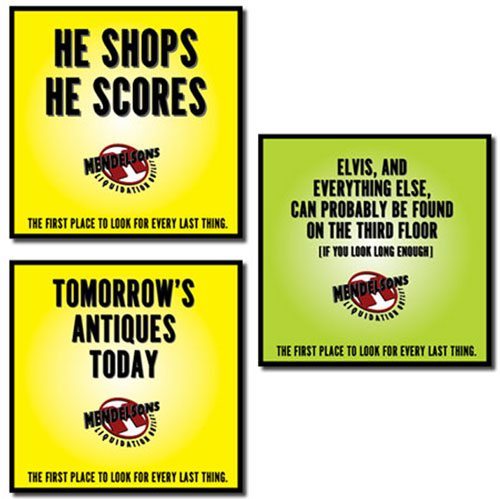
The store is huge… you’re discovering something new at every turn… scattered throughout the store are signs like these Hermes award winners just to remind you that you are experiencing “one of life’s great adventures.”
by Next Wave Team | Aug 23, 2011
The Challenge
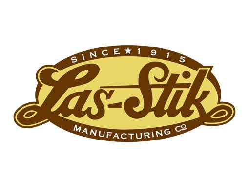
Being new isn’t the only way to be happenin’. Sometimes coolness is rediscovering something old, doing some historic renovation and revitalizing it.
The Solution
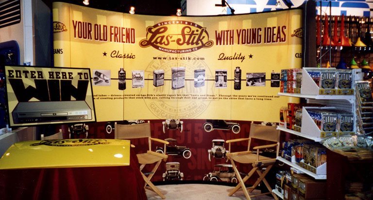
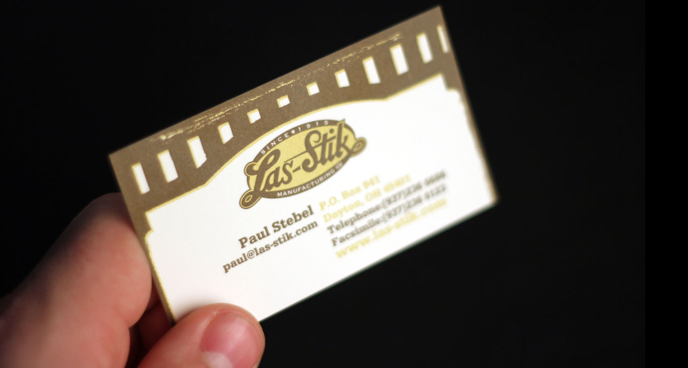
Las-stik has been around since 1915 and has a long history of cool collateral. Unfortunately, “modernization” stole their quirky soul a few years ago. We are happy to have made this mark, the beginning of a comeback for the classic brand.
Taking images and copy from their classic advertising we were able to easily make our client’s new trade show booth a hit.
Adding the rear bonnet of a custom rod with the Las-Stik logo on it gave them the perfect way to demo the product. Sales skyrocketed as did leads after the new booth made its debut.
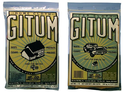
Las-Stik’s new brand mark needed a new way to be shown off. The complete identity redesign sprang from our initial redesign of their logo and branding. For these pieces we decided to further explore the company’s collection and revitalize their classic packaging design. This allowed us to capitalize on the history of the brand as well as develop a consistent identity.
Considering that their old packaging is a collector’s item, it would have been a shame not to use it.
While everybody else tries to modernize package design, we thought that the oldest part in the GM parts catalog should show its heritage. Our two-sided packaging design saves the client money and highlights the products home and auto uses.
by Next Wave Team | Aug 23, 2011
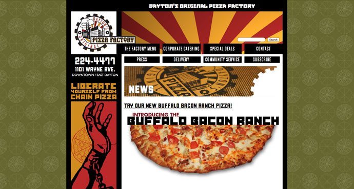
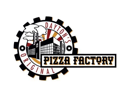
We loved their pizza, but thought their existing logo had no connection to their name. Combining Russian Constructivist style with contemporary design, this logo speaks far more to the industrious nature of this local pie producer.
Designed 4 years before it was implemented, this logo has been a key part of the total re-branding of this small pizza shop. It has gone from neighborhood secret to statewide buzz.
With pizzas like “Chicken Cordon Bleu”, “Greek Gyro” and “Seafood Blanc” the responsive site matches the hipness of the food. The site is just one part of the overall branding effort. New packaging, t-shirts and a new look for the outside of the store is all part of the strategy to make this forward thinking pizza joint the lunch business caterer of choice in Downtown.
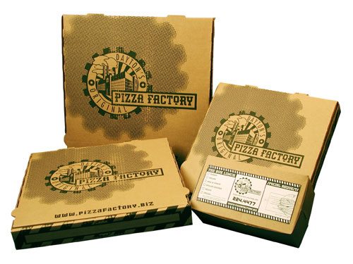
It’s not often that moving from an expensive three color box on bleached paper to a one color print on raw corrugated cardboard is the solution. But for our industrious friends at Pizza Factory, it fit.
The new packaging has become the cornerstone of this brand building campaign. Attitude is everywhere on this box. Of note is the statement printed on the bottom: “If you’re reading this, it’s time to reorder.”