Logo
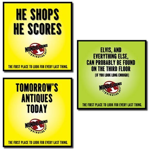
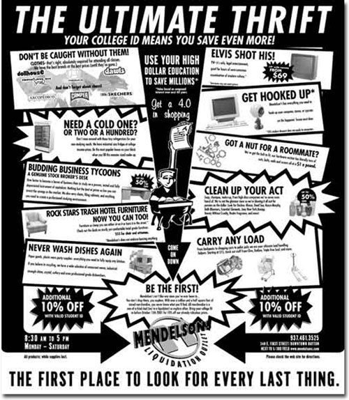
The Challenge
Retail brand marks need to be easily identifiable. Whether in a magazine, billboard or the web, the mark needs to instantly conjure up the identity of the client.
The Solution
For Mendelson’s we juxtaposed a retro design 3D type effect with the bold red M. It is a mix of old and new, much like the items the client sells. It gives this discount liquidator the strong image they needed for quick identification.


Video
Energy Bar — Wouldn’t you just know it…right after this spot started running, Mendelsons liquidated a bunch of energy bars and started selling them at the front desk. Getting lost up here wasn’t really a joke, it was possible, which made the television spot resonate with those who knew the store and made others wonder.
Dot Gone — The client wanted dollars off and brand names. We wanted to concentrate on the message. In what turned out to be one of our last spots for the retailer, we tried to compromise by getting both in. We believe the success of our campaign was based on the unique qualities of the store, not price. Anyone can match your price, but no one could match the experience. You be the judge, which do you think would make you more likely to shop there?