Logo
We loved their pizza, but thought their existing logo had no connection to their name. Combining Russian Constructivist style with contemporary design, this logo speaks far more to the industrious nature of this local pie producer.
Designed 4 years before it was implemented, this logo has been a key part of the total re-branding of this small pizza shop. It has gone from neighborhood secret to statewide buzz.
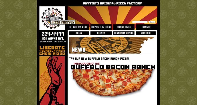
Website
With pizzas like “Chicken Cordon Bleu”, “Greek Gyro” and “Seafood Blanc” the responsive site matches the hipness of the food. The site is just one part of the overall branding effort. New packaging, t-shirts and a new look for the outside of the store is all part of the strategy to make this forward thinking pizza joint the lunch business caterer of choice in Downtown.
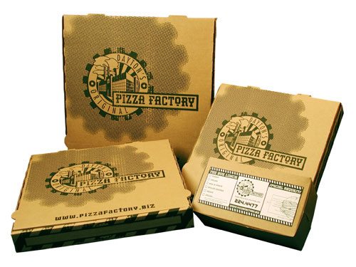
Packaging
It’s not often that moving from an expensive three color box on bleached paper to a one color print on raw corrugated cardboard is the solution. But for our industrious friends at Pizza Factory, it fit.
The new packaging has become the cornerstone of this brand building campaign. Attitude is everywhere on this box. Of note is the statement printed on the bottom: “If you’re reading this, it’s time to reorder.”