by Next Wave Team | Jul 23, 2012
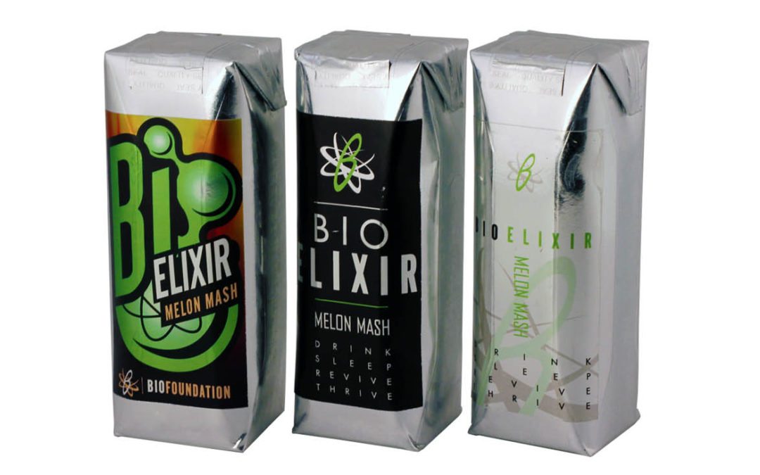
Bio Foundation was a fun energy drink brand that we were involved with all the way from the naming stage. We designed several packaging ideas for what would have been the company’s first product, the Melon Mash flavor of Bio Elixir. The packaging was unique and eye-catching, and the labels we designed looked great on the foil cartons. The packaging captured the brand perfectly.
by Next Wave Team | Aug 26, 2011
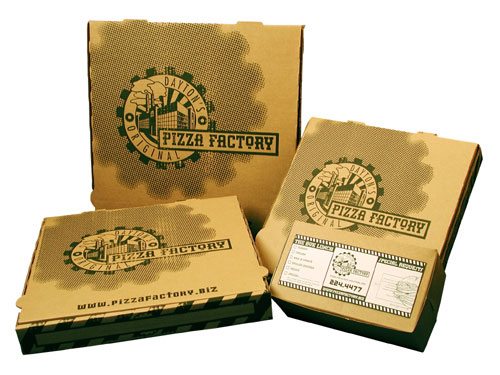
It’s not often that moving from an expensive three color box on bleached paper to a one color print on raw corrugated cardboard is the solution. But for our industrious friends at Pizza Factory, it fit.
The new packaging has become the cornerstone of this brand building campaign. Attitude is everywhere on this box. Of note is the statement printed on the bottom: “If you’re reading this, it’s time to reorder.”
by Next Wave Team | Aug 26, 2011
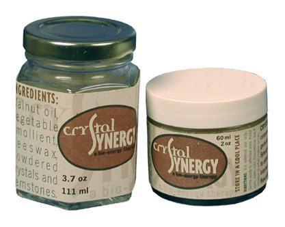
Holistic healers believe that crystals can help release energy to heal. If you believe that, well then this is the stuff for you. A two color print job on an earthy stock made this low budget design project look like a high dollar value. The Next Wave also generated the name, but if you ask us nicely we’ll tell you the first choice name that the client rejected. Please don’t call us for his number, it’s (937) 312-1009 - tell Harvey to hire The Next Wave to build Crystal Synergy a website.