by Next Wave Team | Jun 22, 2020
Doctors need branding too.
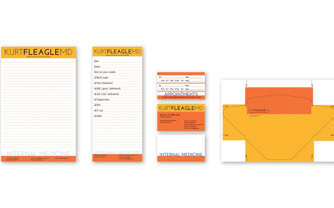
When Dr. Kurt Fleagle was moving offices, he thought it was also time for moving his practice forward visually. As an independent practitioner competing against the duopoly mega-medical brands in town, standing out from the run of the mill was critical.
With a non-traditional color palette, clean crisp type and a warm and comforting vibe, the brand has stood the test of time and allowed the good doctor to grow his office.
by Next Wave Team | Mar 9, 2012
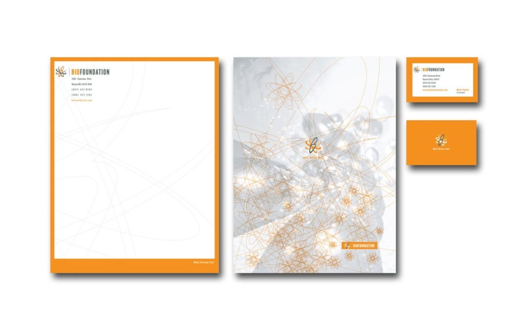
There are a ton of energy drinks- there are a ton of supplements, and our client, a body-builder, thought he had the start of the next big thing in energy drinks. It was going to be an entire system of products that would make you into the most amazing muscle machine ever. This is a naming category where a lot of good names are taken.
We came up with the name, then the mark and the sub-brand of the drink: Bio-Elixir. We worked on the packaging for the product that never made it to market. There’s an interesting story behind all this, but, if we told you, we’d probably have to enter the witness protection program.
by Next Wave Team | Mar 9, 2012
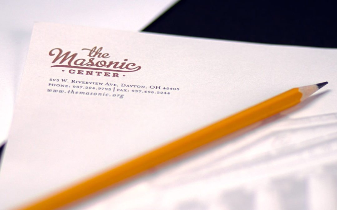
There was a bit of an identity crisis for the Dayton Masonic Center- you see, right on the front of the building, carved in stone is “The Dayton Masonic Temple” and the average person doesn’t think that a Temple is a place to have a party.
We really wanted the logo to read “The Masonic Dayton” to delineate it from other Masonic Temples all across the country, but the membership didn’t want to put “Dayton” in the logo.
This mark is to be used on all materials promoting the center for conferences, concerts, weddings, events and banquets. It’s a key part of the website that we also designed. www.themasonic.org