by Next Wave Team | Aug 23, 2011
A dentist who used to be a graphic designer is a tough to please client. That being said, we appreciate a challenge.
Differentiating dentists with an image of smile isn’t original or easy. However, we find that working within constraints forces creativity. We crafted a fresh, yet classic look that conveys a pleasant experience without seeming hokey.
by Next Wave Team | Aug 23, 2011
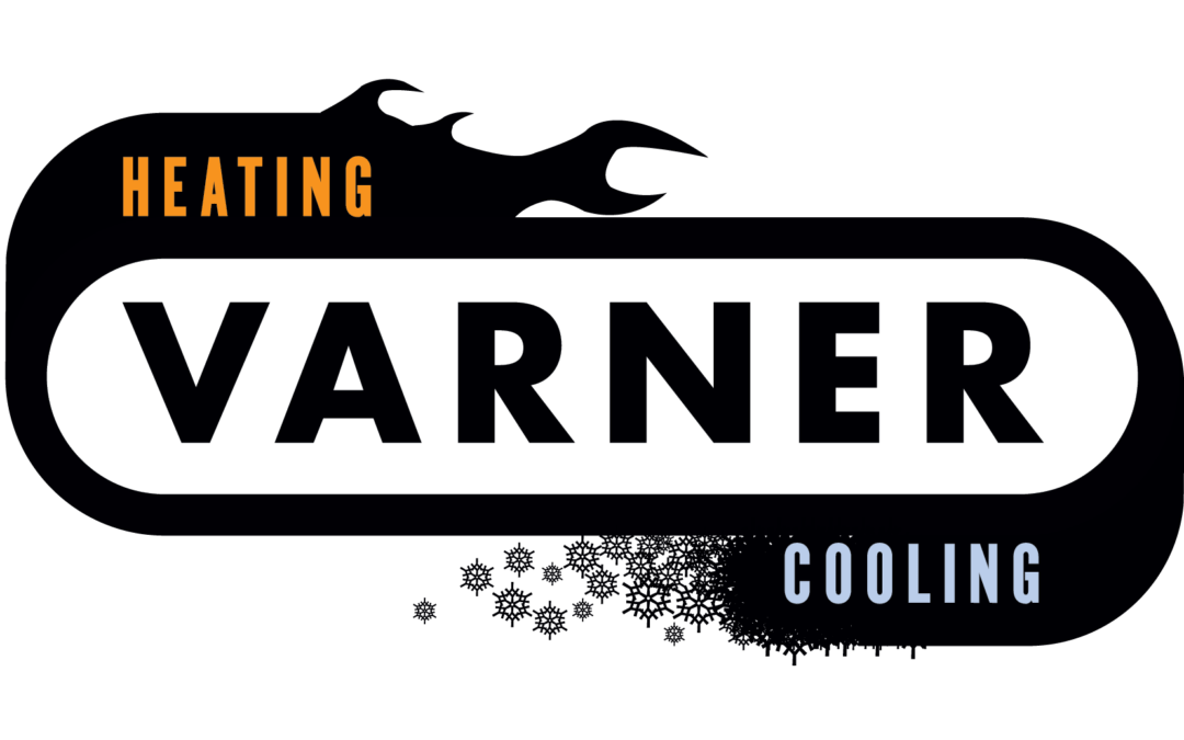
Bob’s HVAC logo is one you might have seen in your city. It’s the one with a frumpy, hand drawn repairman, tools in hand, crumpled cap on his head… While it may be earnest and cute it doesn’t give you much confidence in the ability and knowledge base of that business.
There are a million logos out there for heating and air conditioning contractors, this logo design doesn’t look like the rest. It’s sleek, modern and distinct. This logo speaks to our client’s contemporary knowledge and up to date skill set. Plus it’s a heck of a lot cooler (no pun intended) than a Mr. Fix it style doodle.
by Next Wave Team | Aug 23, 2011
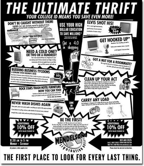
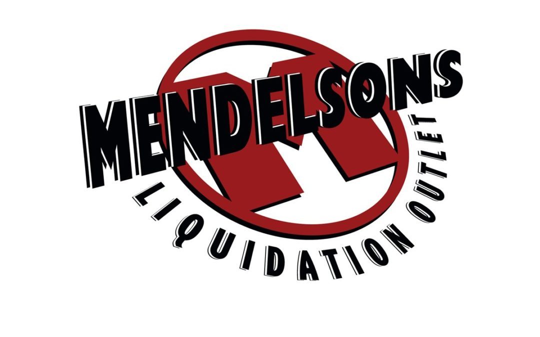
The Challenge
Retail brand marks need to be easily identifiable. Whether in a magazine, billboard or the web, the mark needs to instantly conjure up the identity of the client.
The Solution
For Mendelson’s we juxtaposed a retro design 3D type effect with the bold red M. It is a mix of old and new, much like the items the client sells. It gives this discount liquidator the strong image they needed for quick identification.
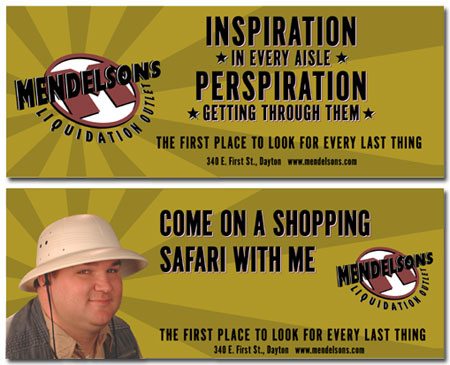
Expedition — This is the TV spot that started it all. The introduction of the “explorer” character who embarked on “one of life’s great adventures” roaming the regions of Mendelsons. The pith helmet, vest and attitude set the way for a whole series. Some people actually came in asking about the US Geological Society field office.
Energy Bar — Wouldn’t you just know it…right after this spot started running, Mendelsons liquidated a bunch of energy bars and started selling them at the front desk. Getting lost up here wasn’t really a joke, it was possible, which made the television spot resonate with those who knew the store and made others wonder.
Dot Gone — The client wanted dollars off and brand names. We wanted to concentrate on the message. In what turned out to be one of our last spots for the retailer, we tried to compromise by getting both in. We believe the success of our campaign was based on the unique qualities of the store, not price. Anyone can match your price, but no one could match the experience. You be the judge, which do you think would make you more likely to shop there?
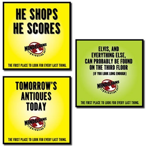
The store is huge… you’re discovering something new at every turn… scattered throughout the store are signs like these Hermes award winners just to remind you that you are experiencing “one of life’s great adventures.”