by Next Wave Team | Mar 14, 2012
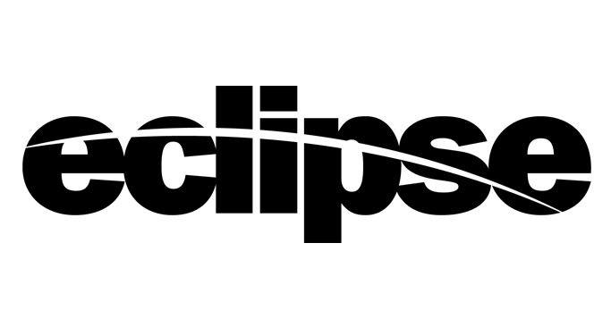
When you are opening a second restaurant in the same market and your name is “The Blue Moon” - first advice is don’t be cute and try to create a whole new brand for a restaurant with the same menu. Our client didn’t listen and went with the name “eclipse.”
by Next Wave Team | Mar 14, 2012
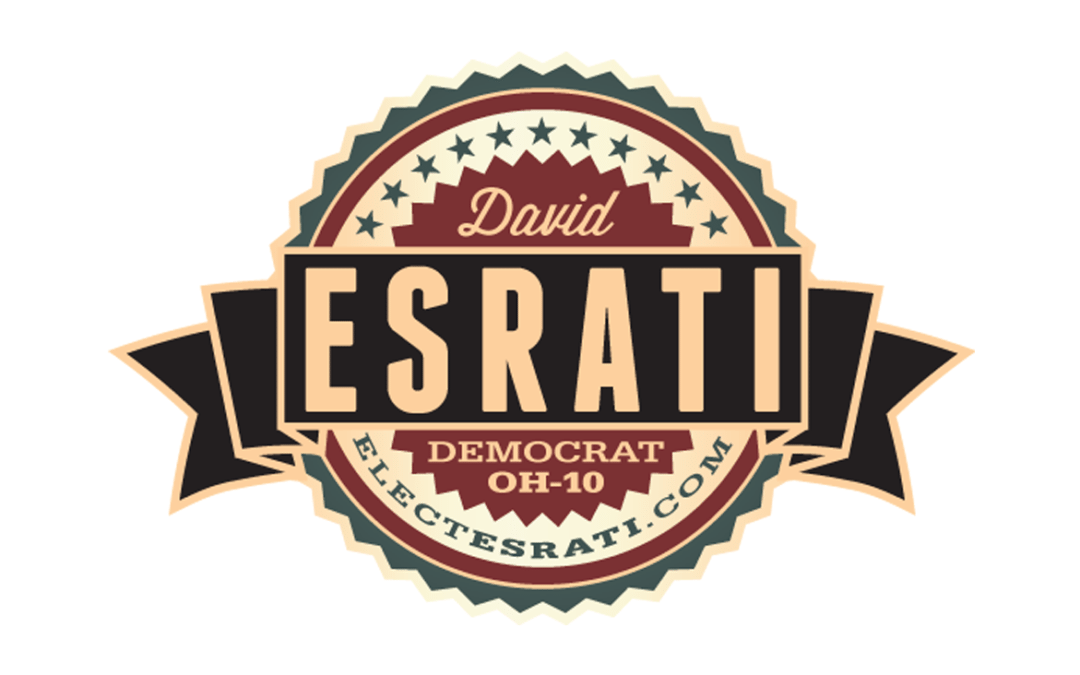
Politicians generally do the same thing. Red, White, Blue- their name in big, sans-serif type, and usually not that interesting. David Esrati is a bit different, he owns an ad agency (The Next Wave- yep it’s our owner) and doesn’t believe ugly sells.
This mark was for his congressional campaign of 2012. He came in third, but in terms of T-shirt sales he beat all his competition hands down.
by Next Wave Team | Mar 14, 2012
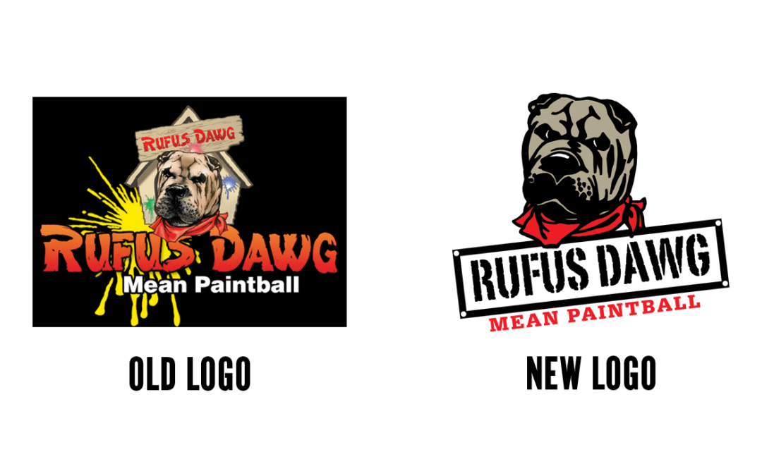
When he came to us, Rufus wasn’t very pretty- or easy to reproduce. When the new owners of this paintball accessories firm took over the brand the “dawg” had a different look on every piece of packaging- as well as the mug of the dawg embossed or debossed on almost every product. The name was included sometimes- and others, it wasn’t. The “logo” didn’t really work in 1, 2 or 4 color.
We redesigned it to work in one color or many.
This brand needed a makeover into a consistent brand image. The new look incorporates the mascot, the brand name and the tagline all in one. You might even want to have it on a shirt.