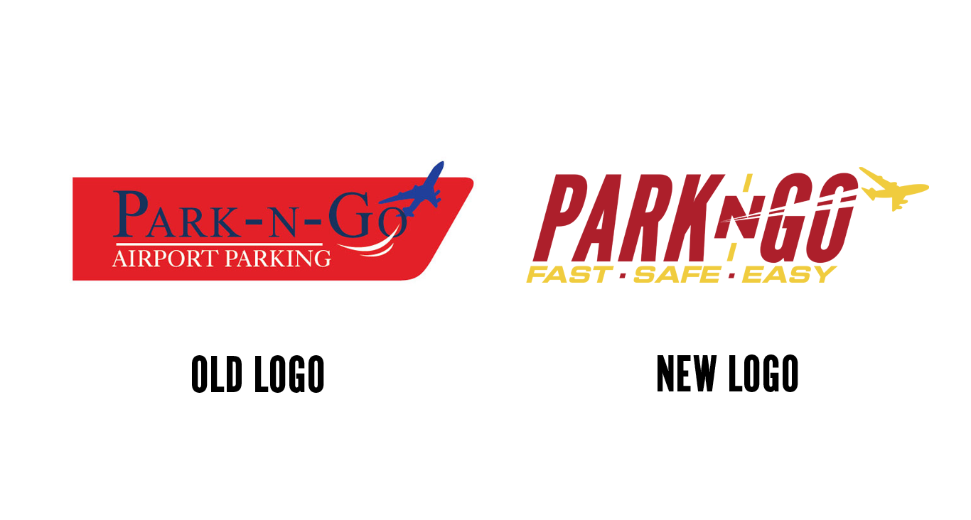
When we were first approached by the client, he’d been shopping agencies. One of them said “we wouldn’t change the logo”- and we even agreed we could live with it.
But, after working with the old logo, we knew we could improve it. We did a comp. Took a deep breath, and presented it.
The moment we showed the update to the client, he loved it. Not only does this version reproduce and read better, it takes up less space to say the same thing. That’s what a logo should do- clearly and concisely communicate the brand.
We also decided that saying “park” and “parking” in the logo was too much. “Fast. Safe. Easy.” does the descriptive job much better.

